The Problem with iOS
These past few months I’ve seen a fair number of articles about people who switched from iOS to Android. Most of those articles talk about the differences between the 2 operating systems, and how some of those differences proved to be significant enough for whoever was switching: multitasking, notifications, the so-called “open vs. closed”, etc. That’s fine, but these specific bullet point list vs. bullet point list comparisons seem to be missing the higher level view of what’s really going on: iOS is just not working the way it should anymore.
When iOS was released in 2007, it made a lot of things easier to do on a phone, compared to the existing competitors. A lot of tasks just felt “right”, or at least “way better”. But it basically stayed there since then. The only real additions, like the notification center or iCloud, are either incredibly badly designed, or are only usable if you have an almost exclusive Apple-based household (which you shouldn’t). When I look at my iPad now, I feel like I’m looking at a computer that hasn’t been updated in years.

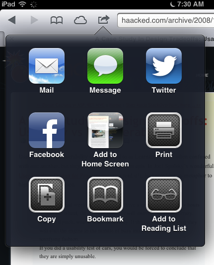
If I’m reading something in Safari, I should be able to quickly send it to Pocket, Buffer, Dropbox, or whatever other service I choose to base my workflow on. But on iOS, the only “sharing” services I have access to are those that Apple thinks I should use. For everything else, I need to copy the URL, switch to another app, and find where to paste it. Why?

If I added a few articles to read on Pocket late yesterday evening, I should have them ready on my phone or tablet the next morning so I can read them during the commute. But on iOS, I have to remember to open the Pocket app so it can sync. Why? (note that other apps like Instapaper try to use the Location Notification API but frankly, by the time I leave the house, and therefore lose any WiFi connectivity, it’s already too late).

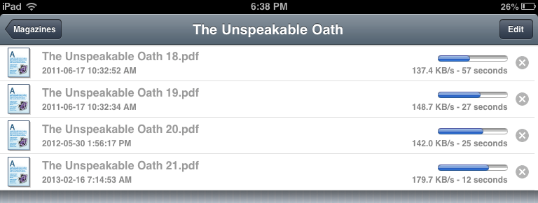
If I just bought a bunch of PDFs from DriveThruRPG, e23, Arc Dream or Pelgrane, or some comicbooks from Panel Syndicate or Thrillbent, or whatever else I want from whoever I feel like giving money to, I should be able to just download those files onto my device and open them with any application I like. But on iOS, unless it’s coming from iTunes (directly or via in-app purchases, all of which also means 30% of my money doesn’t even go to the people I want to give my money to), I have to jump through many hoops, going first through Dropbox or FileBrowser and then having to re-transfer every. single. file. to each of their application’s sandbox storage. Why? Oh why?
You may not be surprised to learn that all of those things “just work” on Android. And those are just examples of the frustrations I’ve had with my iPad in the past few weeks. You don’t just go “BOOM!” anymore – quite the contrary: you actually have to work harder to make things happen.
Some people might be tempted to boil this down to a simple list of features, like “iOS needs a background service API, shared storage, and more extensibility points for 3rd party apps”. This sounds to me like going back to 2007 and saying “Windows Mobile needs to make the stylus optional, have a grid of icons on the home page, and remove copy/paste”. Really, it’s not just about a bullet point list of features. It’s about the whole philosophy of the system, and of the company behind it. And although Apple seems to be occasionally bowing down to the pressure of the market, like when it released the 7″ iPad Mini, I don’t expect it to change this radically on the design of iOS.
Would I rather have an iPad Mini instead of my Nexus 7 to bring with me everywhere I go? Of course I would. The iPad Mini is thinner, lighter, and has a better screen. But as someone famous once said, “[design is] not just what it looks like and feels like. Design is how it works”. And for me, iOS is just not working well enough. And it never did, really – it’s just that until the competition caught up with the basics, only a minority of users noticed it.
