Ramblings of General Geekery

Showing off your dotfiles

With the introduction of my first Apple laptop a few years ago, my home computers went from being half Unix-like (I had a healthy mix of Linux and Windows machines) to mainly (two thirds) Unix-like. With it came a change in the kind of software I use on a daily basis and an increased need to synchronize the configuration of those programs between my machines.

Enter the “dotfiles community”: an informal group of people who, as Zach Holman puts it, think that “dotfiles are meant to be forked”.

“Dotfiles” are rooted in Unix culture – the name refers to the configuration files starting with a dot that clutter your home directory like crazy. This means you will mostly find Mac and Linux users in there (that’s ok, they’re pretty nice… usually), but to me it’s mostly about putting all your configuration files in source control in a way that makes it easy to setup new machines and share with others.

Show-off :-)

So like everybody else, I put my dotfiles out there for anyone to poke around. They’re mostly boring, but you may find a few useful things, like those I outline below (after the break). Nothing earth-shattering, but if it saves you the 15 minutes needed to write it, that’s 15 minutes you can spend on doing actual stuff.

Boostraping

Most people store their dotfiles in a Git or Mercurial repository, and then create symlinks from their home directory into the repo (like, for instance, linking $HOME/.vimrc into $HOME/DotFiles/vim/.vimrc). Because I also need some of those configuration files on Windows, I can’t really hard-code paths like this.

As a result, I opted for generating some of my dotfiles when I run my install script. Those dotfiles mostly only include the real ones from the repo. This lets me clone my dotfiles repo anywhere I want – no need to hard-code anything.

Mercurial config includes

An often overlooked feature of Mercurial’s config files is the %include statement which lets you include other config files. This lets me specify OS-specific config files to my hgrc, and even optionally have a local config file (since the %include statement will quietly fail if the included file doesn’t exist).

Cross-platform, multi-language Vim

If you’re running Vim on both MacOS and Windows, you may be interested in a few lines from my .vimrc, like when it figures out the directory for all the Vim runtime files (.vim on MacOS, vimfiles on Windows).

You may also be interested in a couple of international features I have:

  • A mapping to switch keyboard layouts in input mode (I switch between English and French)
  • A mapping to switch spell-checking on and off, and the language it will be checking against is in sync with the input mode keyboard layout.

That’s it! I hope somebody finds it helpful in some way.


Lawrencium — A Mercurial Wrapper For Vim

I’ve been using Vim for quite a while now, and by no means am I an expert in it (I’m still learning all kinds of cool tricks every week), but I recently decided it was time to write my first plugin. And because I mostly use Vim at home, where I work with Mercurial, I figured I could write a Mercurial plugin for Vim.

vim

Steve Losh had been asking for such a plugin for quite some time so I thought that might be helpful to at least another guy besides me. And ironically enough, I started learning Vimscript with Steve’s very own book-in-progress, “Learn Vimscript the hard way”.

The result of this initiative is Lawrencium, which is available on Bitbucket and at Vim.org.

There’s a good description of how it works on the Bitbucket page, and you’ll see it’s inspired in some parts by Tim Pope’s Fugitive plugin, which wraps Git workflows and features inside Vim.

It’s still a work in progress so be sure to leave some feedback here or in the issue tracker.


Navigation menu in PieCrust

Here’s another post in the PieCrust cookbook series, this time focusing on a classic web-design pattern: the navigation menu.

Menu

It’s really just a bunch of links that you can put somewhere around each page’s content, but the trick here is to tell the user which page he’s currently on. This is pretty easy to do using Twig macros and the data exposed by PieCrust, assuming of course you’re using PieCrust’s default template engine.

Let’s start by building a simple layout. I skipped the parts that are not relevant:

    <!doctype html>
    <html>
    <body>
        <div id="content">
            {{ content|raw }}
        </div>
        <div id="navigation">
            <ul>
                <li><a href="{{ pcurl('') }}">Home</a></li>
                <li><a href="{{ pcurl('something/foo') }}">Foo!</a></li>
                <li><a href="{{ pcurl('about') }}">About</a></li>
                <li><a href="{{ pcurl('contact') }}">Contact</a></li>
            </ul>
        </div>
    </body>
    </html>

This is a pretty standard PieCrust layout, but we want the user to know which one of those 4 navigation links is the current page. Here’s a way to do it.

Step 1: Write the macro

You can write a macro that, depending on the current page’s “slug” (the page’s URL name1), prints either a link or just some text with the active class.

{% macro nav_entry(slug, current, label) %}
{% spaceless %}
{% if current == slug %}
<span class="active">{{ label }}</span>
{% else %}
<a href="{{ pcurl(slug) }}">{{ label }}</a>
{% endif %}
{% endspaceless %}
{% endmacro %}

Note the use of the spaceless tag to make sure we don’t have ugly carriage returns and spaces in our resulting markup (we want everything on one line). This is not required – it just makes the HTML prettier.

Step 2: Import the macro in the layout

You can either put the above macro in a separate file (say, _content/templates/nav_macros.html), or at the beginning of your layout file – it depends on whether you want to reuse those macros elsewhere, and whether you want to keep your layout markup cleaner.

If you put the macro in a separate file, you’ll need to import it in your layout file with Twig’s import tag:

{% import "nav_macros.html" as nav %}

Here, we imported in the nav namespace, so you can call your macro with nav.nav_entry.

If you put the macro right there in the layout file, you have to prefix the calls with _self like so: _self.nav_entry.

For more information, see the Twig documentation on macros.

Now you can replace the navigation links with calls to the macro:

    <div id="navigation">
        <ul>
            <li>{{ nav.nav_entry('', page.slug, 'Home') }}</li>
            <li>{{ nav.nav_entry('something/foo', page.slug, 'Foo!') }}</li>
            <li>{{ nav.nav_entry('about', page.slug, 'About') }}</li>
            <li>{{ nav.nav_entry('contact', page.slug, 'Contact') }}</li>
        </ul>
    </div>

Unfortunately, you need to pass page.slug to the macro every time because the macro doesn’t have access to the current context as far as I can tell.

Add a bunch of CSS styles that will handle the active class and voilà, you’ve got a nice navigation menu.

I’ve slapped together a little demo website here so you can see it in action.


  1. Strictly speaking, PieCrust’s definition of “slug” is not quite correct since it includes the root-relative folders that contain the resource, but… well… whatever. ↩︎


The Journey to Digital Comics: Reading Device

The first step in the journey to digital comics is to figure out what you’re going to read them on. These days, the answer is pretty much going to always be “a tablet”… but which one?

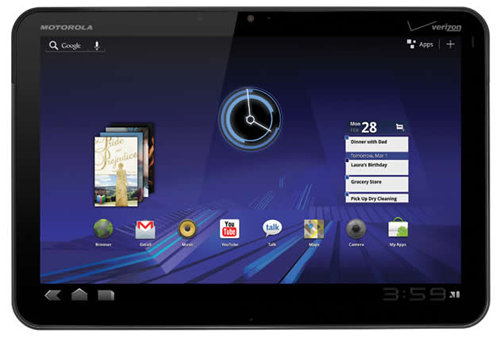
I had a quick look at the market back in late 2011 and here’s how I made up my mind. First, I focused on the main ~10 inch tablets of the market. This included, for instance, the Motorola Xoom, the Asus Transformer and the Apple iPad 2.

Orientation

Can you see the most obvious difference between the iPad and the other two?

I made it easy for you by showing the iPad in the vertical position, because that’s its natural position: the home button is at the bottom, and the front camera is at the top. In constrast, the other tablets’ natural position is horizontal, with their front camera and power/sleep buttons placed accordingly.

Since reading a comic-book happens almost always in portrait mode, I figured I’d might as well choose a device that’s also designed for that orientation, if possible.

Aspect Ratio

Another important spec for me was the aspect ratio. The iPad has a 4/3 ratio whereas pretty much every other tablet on the market has a widescreen ratio, most of the time 16/10 (which is the case for the Xoom and Transformer).

I don’t know about you but holding a widescreen device vertically just feels wrong to me – it’s too narrow and too high, like I’m reading a mutated book. It’s entirely subjective, of course, and you may not mind at all.

Display Size

Of course, there’s the matter of effective size of the display. Assuming a vertical orientation, here are the pixel densities and screen sizes of each tablet:

  • Xoom: 160ppi, 12.7cm x 20.3cm.
  • Transformer: 149ppi, 13.6cm x 21.8cm.
  • iPad 2: 132ppi, 14.7cm x 19.7cm.

A standard American comic-book is 17cm x 26cm, so no tablet comes even close to reproducing that real-world reading experience (I wish somebody would make a bigger tablet!), but you can still figure out which one gives the best reading experience.

Here is a comparison of all 3 tablets’ screens (black borders indicate parts of the screen that would not be covered by the comic-book page):

The Xoom and the Transformer have the same resolution, which is higher than the
iPad’s, and it’s obvious you’d get a finer picture on them. However, if you
scale the screens so that they match their relative physical world size, here’s
what you get:

Here you can see that a comic-book displayed on a Xoom would be pretty much the same size as on the iPad – sure, you would get a better picture thanks to the higher resolution, making reading captions slightly more possible, but not any more comfortable without zooming a bit. The Transformer is clearly better here: the displayed page is bigger and it’s got a higher resolution to back it up.

Final Choice

With digital comics as the only requirement for your choice of tablet, the Asus Transformer Prime is the winner for me. However, I also had some secondary requirements:

  • Help me get through my RSS feeds more efficiently.
  • Let me read my Instapaper queue in a comfortable way.

The sad thing is that Flipboard, on iPad, really blew my mind for reading RSS feeds, and there’s no good Instapaper client on Android yet. It was a tough choice, as I went back and forth for a long time between the iPad and the Transformer, but I picked the iPad in the end. I figured that the loss in the comic-book reading experience was not too bad compared to the significant advantages I would get on my other use-cases.

There was of course the issue of my control over the device – something that always annoys me with Apple products (I ditched my iPhone for a Galaxy S Captivate because of that). But given my requirements, it wasn’t such a problem: both digital comics and RSS feeds are managed on the cloud, and most other applications did a good job of working around Apple by supporting 3rd party services like Dropbox for storage and syncing. If you have secondary requirements involving heavier stuff like music or video and you don’t like to play (pay?) by Apple’s rules, you may again want to choose the Transformer.

Spending the money on the tablet was not too hard. I sold some of my collection (mostly single issue series I either planned to replace with TPBs, or get rid of altogether), and that alone pretty much paid for it. That’s how much comics surplus I have in my home, begging to get uncluttered through the sweet release of digital media!